


Dear Serif: The love letter I didn’t mean to write
For the font that holds my heart while I hit delete, and still dares me to press publish.

Chapter 9
Dear Serif, you feel like a soft Sunday morning
Here’s how it all started.
I sat down to write Part 2 of my exploration into vulnerability and failure, something honest, unfiltered, and trembling like skin in cold air. The kind of piece where you don’t just write to express, you write because it feels like a necessary exhale.
Because holding it in would be worse.
I thought I was ready for it. I opened a blank page with the intention of diving into the holy discomfort of being seen. Of walking readers through what it means to create when you’re still healing. To show up while still stitched together by fear and scar tissue. But as soon as I met the page, the words refused to land where I expected.
So, instead of writing the next chapter of my vulnerable unraveling…
I wrote a love letter.
To a font.
Yes. A font.
Her name? Serif. (We’ll go with “her”, because anything that elegant, loyal, and quietly emotional deserves pronouns.)
She’s the classic one. The one that holds my hand when I’m not sure I have the strength to hit publish.
And before you scroll past thinking I’ve absolutely lost it, stay with me. Because this was not just an aesthetic infatuation, it was something else. Something softer. Something sacred.
I realized, sitting there with my cursor blinking like an impatient therapist, that almost every idea I’ve nursed into existence lately has carried the fingerprints of this font. Serif is not just typography. For me, it’s a soft ritual. A shape for my voice. A quiet place to hold me when I’m shaking.
Every draft on Substack. Every visual in my head. Every outline for the projects that are coming and I’m afraid to name just yet. It’s all in Serif.
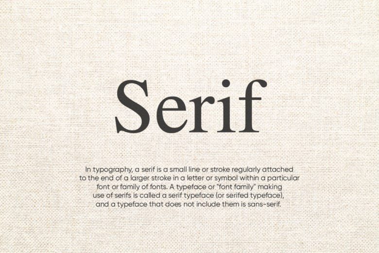
For the unfamiliar, Serif is that old-fashioned font you see in books and vintage newspapers. The one with the tiny hooks on each letter, the elegant curve at the bottom of the “G,” the little arms on the “T.”
It’s not flashy. Not modern. Not trendy. It’s elegant. It makes my writing feel like it belongs to something older than the algorithm. And honestly? That’s enough for me right now. Because creating in public, writing about shame, failure, and what it means to be seen before you’re “ready”, requires a kind of sanctuary.
It’s my unsung muse.
Serif fonts were born from stone. Literally. Carved into marble and metal across the Roman Empire, they were the first elegant attempt to make language last. You’ll find it described in typography textbooks as “a flare at the end of a letter terminal” or “a typeface with small decorative strokes.” Wikipedia softens it further, “non-structural details on the ends of some of the strokes.”
To me, it feels more like punctuation with presence, a hush at the end of every word, asking you to linger.
And somehow, those so-called “non-structural details” felt personal. Like a quiet metaphor for the parts of ourselves we try to edit out, the ones that, in truth, hold the most soul. Because what else is a creative life if not that? The details. The subtleties. The tenderness we add when no one’s asking us to.
That flick of ink at the end of a letter, useless to some. Unforgettable to others.
Serifs were born to increase legibility.
In ancient Rome, they were chiseled into stone not for decoration, but for clarity, for the human eye to better follow the rhythm of language carved into permanence. Over time, they stopped just guiding the eye, and started guiding emotion. A typeface like Garamond or Baskerville doesn’t just say something. It feels something.
It carries the gravity of a book spine, the whispering of a library, the kind of quiet confidence that doesn’t beg for attention, it earns it. It’s the font of declarations. Dedications. Eulogies. Of love letters found in drawers and worn pages passed between generations. Of handwriting you can still recognize decades later. Of messages inside bottles that washed up from the ocean, fragile and stubborn, like hope.
It’s the typeface of memory. Of meaning. Of everything that matters enough to be preserved.
And maybe that’s what drew me in. The unspoken promise that you don’t have to shout to be heard. That elegance is not performance, it’s presence.
Sans serif screams minimalism. Serif whispers meaning.
So this might look like procrastination…me avoiding what I meant to write. But what if it wasn’t avoidance at all? What if it was creativity sneaking in through the side door? The words weren’t coming for the essay I planned. But they were arriving for something else. Something that didn’t need an outline. Just a heartbeat.
And that felt like enough. Because vulnerability doesn’t always come in big declarations.
Sometimes it comes in fonts. In rituals. In love letters you didn’t mean to write but couldn’t hold in anymore. And who knows, maybe this is the beginning of a new soft experiment. A series of “Letters to my Companions”, the fonts, notebooks, weird rituals, and tiny emotional support objects that hold us together in our most glorious creative failures.
Shorter chapters. Same big truths. More heart. Less overwhelm. More space to breathe.
And maybe…a new room for something else.
Like the “Notes from the Emotionally Fluent.” My new series for the emotionally fluent: short reflections on long feelings. Written in Serif. Felt in silence. Maybe it’ll live quietly inside the Glorious Fail. Maybe it’ll outgrow the page and ask for its own space. But for now, it lives and breathes in Serif.

While this isn’t the vulnerable beast I originally meant to post, it is still vulnerable. Because letting you in on the small, silly, secret things that keep me writing is a form of intimacy. And in its own way, Serif has been there for it all.
She doesn’t rush me. She doesn’t roll her eyes when I rewrite the same line five times. She doesn’t mind the mess. The hesitation. The way I doubt every sentence before I commit. She just…waits. Patient. Solid. Quietly sure of herself.
That’s Serif for me. This isn’t just a font. It’s a relationship. Between a woman who once erased entire stories because they felt too loud, and a typeface that says, “It’s okay. I can hold this.”
While others screamed efficiency, you offered pause. You let my fear unfold slowly. You made my mess look like literature. Every backspace was a goodbye. Every rewording, a soft apology to myself. You didn’t interrupt. You just made it look beautiful.
It’s odd. But it also makes perfect sense. Because if you’ve ever needed a tiny ritual, a familiar layout, a font, a playlist, before you could even begin to share something vulnerable…You already know.
We call this place the Glorious Fail for a reason. Because real creativity isn’t born from certainty. It’s carved out of chaos. Sometimes, the most unexpected things are what carry us through:
A quote you never forgot.
A story you couldn’t shake.
A typeface that felt like it understood you.
This isn’t just about design. It’s about how we survive the page. And maybe, this letter wasn’t part of the plan. But maybe it’s exactly what I needed that moment, and what you need too.
Let softness sneak back in.
A Love Letter to Serif
(An affair with elegance, rhythm, and perfectly spaced heartbreaks)
Dear Serif,
You had me at the first curve of your “G.”
While the others screamed for attention with clean lines and geometric restraint, you whispered, in italics.
You lingered.
You didn’t rush.
You gave the sentence shoulders to lean on.
You gave the thought weight, pause, grace.
Every time I open a new draft, you’re already there. Waiting.
Like a lover who knows exactly how I take my heartbreak:
soft, measured, with just enough space between the letters to breathe.
Sans Serif is efficient.
You are intentional.
They scream minimalism.
You whisper meaning.
When I write in Serif, I don’t send a simple newsletter.
I host a dinner party, for all the versions of me I’m still making peace with.
You feel like literature. Like a soft Sunday morning.
Like a well-dressed breakdown.
You’ve seen my overthinks. My edits. My “delete delete delete.”
And still, you stay. Loyal. Elegant.
Quietly chic in a world screaming for clickability.
Serif, you are the secret signal of our beloved cult.
Those who know…they know.
We’re not just writing.
We’re Serif people.
And we came here to feel something.
With all my punctuation,
Eleni
So here’s your official green light to follow your detours. To write sideways. To fall in love with fonts, if that’s what keeps you going.
Some people write for virality. Others write for legacy. I think I just write to survive myself. And Serif? You’ve always let me do it with a little style.
If this feels like an oddly poetic detour from the usual Glorious Fail spiral, you’re not wrong. You can skip it if you like. Or let it soften you up for what’s coming next. Part 2 of our vulnerability series will land next week. It includes that poem I wrote at thirteen. (Or not. Still negotiating with my inner teenager.)
Either way, expect feelings. And maybe an existential spiral. Or two. Okay, possibly three. And yes, it’ll come with that familiar, warm dose of cozy-cringe.
For now. Read this.
Pick a font.
Write the thing.
Send the letter you were always too scared to.
Cringe a little.
It means you still care.
Now before we meet again, ask yourself: where does your creativity feel most safe?
Then tell me, what’s your emotional support font? Or maybe it’s a comfort playlist, a well-worn pen, a flannel shirt that smells like safety, a weird ritual no one understands but you.
Whatever it is…what helps you keep going, when everything in you wants to hit delete?
More soon.
Stay soft. Stay messy. Stay brave.
Gloriously yours,
Eleni
Every Monday at 13:30 CET, the Glorious Fail will meet you where you are, ready to disrupt, challenge, and rebrand failure.
There are plenty of ways to support the Glorious Fail:
→ If this landed a little too close to home, give it a like.
→ If you have thoughts, feedback, or just want to say hi, drop a comment.
→ And If it cracked something open and want to spread the word, hit that restack button below.
The Glorious Fail is just getting started, and every interaction brings it to life. Let’s fail forward, together. Rebrand failure. Reclaim the story. Rewrite what comes next.
I love this so much!
My favourite one is Georgia, in italic 💓